After the cut the paper
Choices. Always choices. The idea, the elements, the composition, the tools, the doing, the stopping — and the paper.
Handbooks on relief printmaking tend to be roughly divisible into two parts: the first and larger part being concerned with ‘the art’ of things (composition, tools, techniques, subjects, examples), and the latter part focusing upon mechanics — that is, printing. Paper, despite the fact that books are made of it, tends to get barely a mention, and yet paper, like ink, can be the making of a print. In the heyday of block printmaking when an artist drew the work, an engraver engraved it, and a printer printed it, the art of all these processes was more recognised than it is today and yet today the jack-of-all-processes artist printmaker has to master all three.
Recently, I have been making studies for a print in my series The Happy Tree. A couple of days ago, I carved a finch into a 10 x 8 cm piece of grey lino. I used a small v-shaped gouge for the finch and I wondered as I worked how much of that fine detail might not make it onto the paper. In comparison to wood block, lino takes a lot of ink, and the more the ink, the more likely it is that the ink will seep into the cuts and the detail be lost. This is where the paper comes in.

If you’re familiar with my work, you’ll know that I have my favourite papers: white Somerset Satin (250 gsm), Awagami Bamboo (110 gsm), and Sunome Senaka (52 gsm). They are all ‘white’ papers, though none are the white of photocopy paper. Sunome Senaka is the brightest of the three papers. It gives a flat, somewhat glossy black, takes detail well and, given that it is lightweight, it is easy to press by hand. Somerset Satin and Awagami Bamboo give a warmer, grainier texture. They are lovely to hold, but take some pressure with a spoon to build the impression. Of the two heavier papers, I prefer the tone and texture of the Somerset and I appreciate the fact that it is relatively local in its production. I wasn’t sure though that it would be the paper for my study, and so I tried out a few.
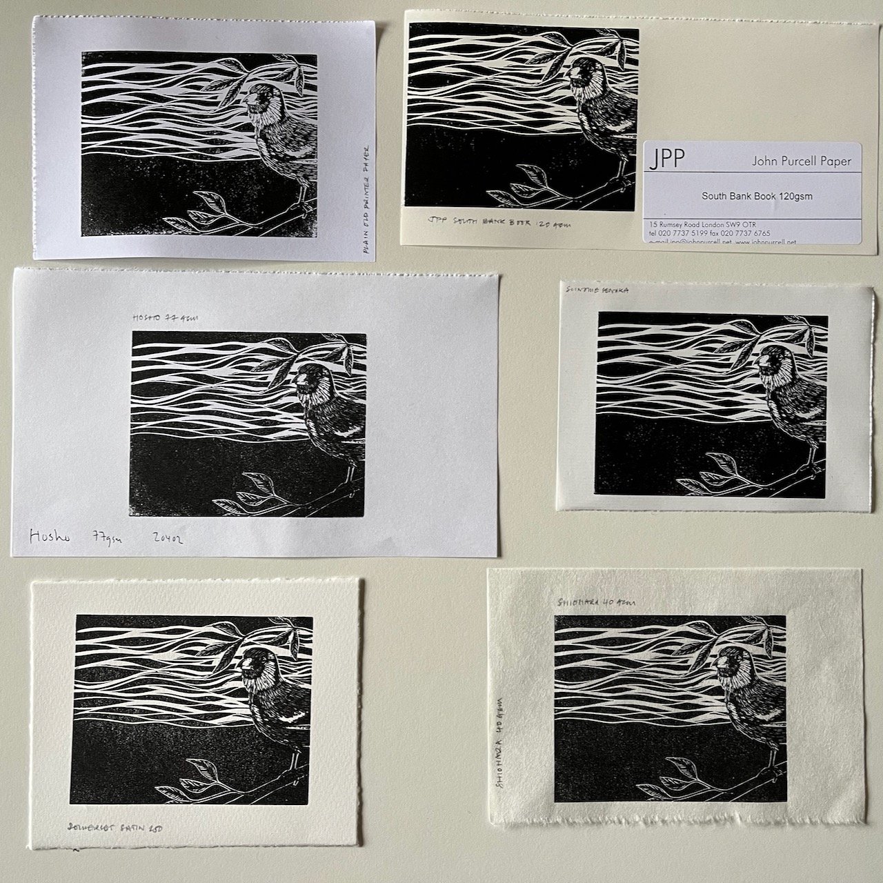
It’s not warm here at the moment (16.0°c in the studio) and the ink that I used (Hawthorn Stay Open) was fairly thick. It eased up a little when worked it hard with the roller. As I was concerned that the ink would seep into the small cuts, I inked the block relatively lightly for each of the papers that I used and picked up less ink on the roller as I progressed through the papers. My fingers are arthritic, and given the cold, they get quite painful, so I pressed relatively lightly when burnishing with the spoon — this resulted in granular blacks on each of the papers. I used five different papers in all (six if you include the photocopy paper that I used to get things started). In the gallery below the impression appear left-right top-bottom in the order in which I pressed them. They are on: standard photocopy paper (75 gsm), South Bank Book (120 gsm), Hosho Select (77 gsm), Sunome Senaka (52 gsm), Somerset Satin (250 gsm), Shiohara (40 gsm).

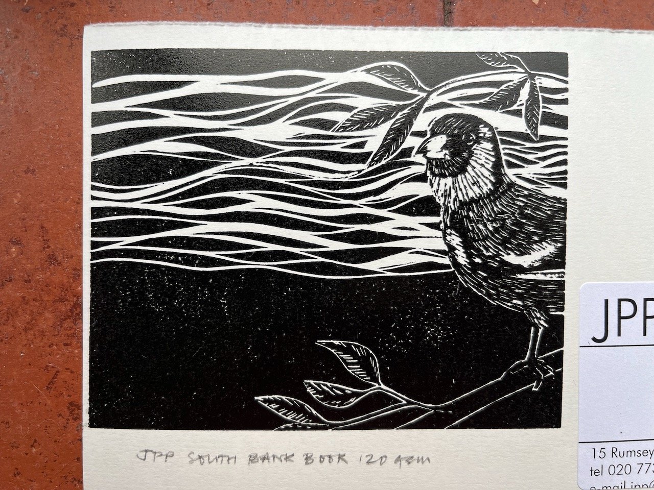


The photocopy paper was used for the first impression so as not to waste more expensive paper (the first impression tends to come light and I generally discard it and often the next as well). Even though I didn’t burnish it for long, it picked up more detail than some of the other papers and it rather surprised me. The contrast between black and white though is very stark and as the paper isn’t acid-free and will yellow in time it’s a non-starter when it comes to printing editions. In contrast, the Shiohara (which was the last impression) picked up the same level of detail, but is much warmer and altogether far easier on the eye. To my mind it is, of all the papers, the one which responded best to the subject. It has the gentleness of Somerset and an equally lovely grain to the black, but in being five times lighter it was an absolute joy to press: it required only a light touch with the spoon. The Hosho and (to a lesser extent) the slightly warmer Sunome Senaka lose something through their brightness. The Hosho also lost detail (though this may be due to my having over-inked the block). I was pleased when I pulled the Purcell South Bank Book; its creamy-white surface opened itself to detail without shouting like the photocopy paper, but it is very smooth and there is something of a slipperiness to the black, a lustre that I find a bit unsettling.
The photo below is not very sharp, but it gives you a sense of how tone and texture compare across the papers. I’m not sure which of the papers I’ll use, though I am leaning towards the Shiohara. I’d be interested to know what you’d choose.